Maven Northwind Challenge
Link to GitHub repository, including data and final output.
1. Project Title
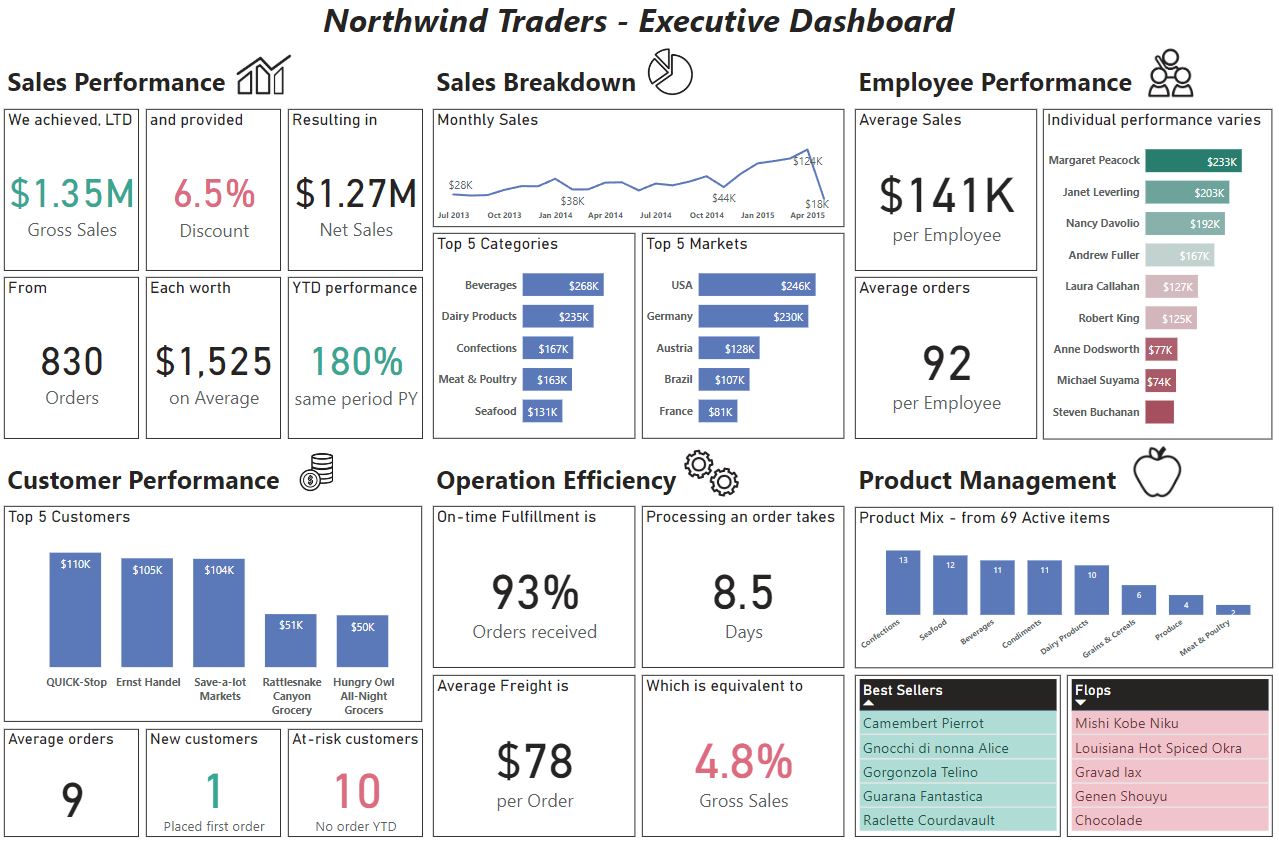
Executive Dashboard of Northwind Traders.
2. Problem
Northwind Traders is a global import and export company that specializes in supplying high-quality gourmet food products to restaurants, cafes, and specialty food retailers around the world.
The task is building a top-level KPI dashboard for the executive team. Its purpose should be to allow them to quickly understand the company's performance in key areas, including: Sales trends, Product performance, Key customers and Shipping costs.
3. Data
Sales & order data for Northwind Traders, a fictitious gourmet food supplier, including information on customers, products, orders, shippers, and employees.
Importing data
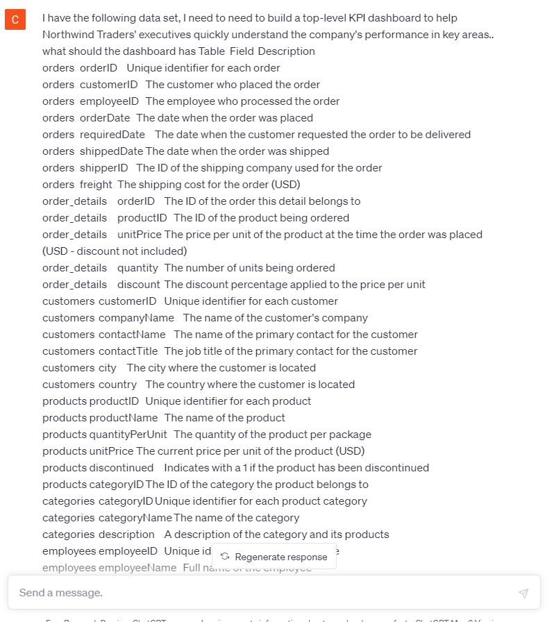
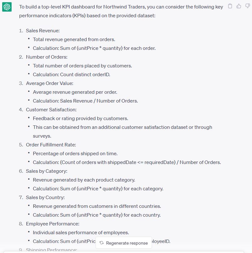
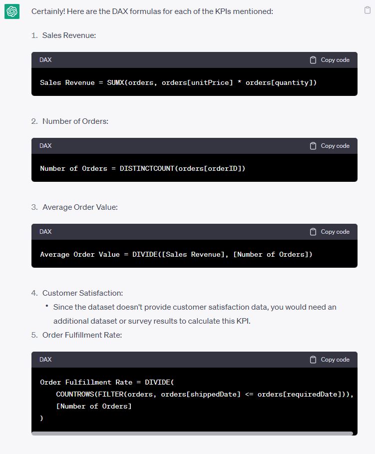
4. Brainstorming with ChatGPT
I asked ChatGPS to suggest KPIs based on the data dictionary.
5. Choosing the KPI groups
The challenge suggested using Sales trends, Product performance, Key customers, and Shipping costs. It was crucial to remember that the challenge was creating an executive dashboard. Therefore, showing high-level figures was more appropriate than detailed figures. Each KPI group could have its own report for further drill down.
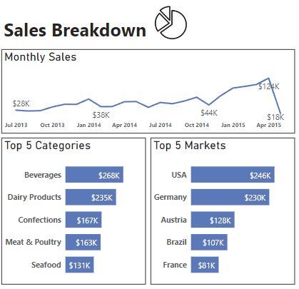
After some thinking, I decided to modify Sales trends into Sales performance (for high-level figures) and Sales breakdown (for charts to visualise sales data).
I added Employee performance because people was important dimension, especially sales staff who were the revenue generators.
I kept the Customer dimension but added more KPIs based on ChatGPT suggestions.
Shipping cost alone was a small topic to explore. Hence I grouped it under Operation Efficiency, adding other shipping measurements.
I changed Product performance to Product management to include the product mix.
When designing each dimension, I kept in mind that people read in a Z pattern. Therefore, I position the visualisations in a similar orientation. To quickly identify each dimension, I inserted an icon that represented it. Also, I wanted to tell a story with the data, so I utilised headings and labels to add a personal touch.
6. Results
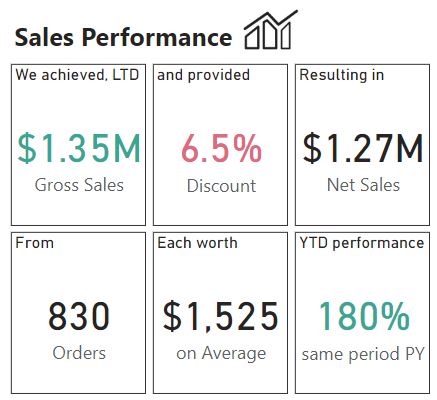
+ Net Sales: similar to Gross Sales but adding *(1 - discount).
+ Discount rate: 1 - (Net Sales/Gross Sales)
+ Number of orders: using DISTINCTCOUNT over order[orderID].
+ Average Order value: DIVIDE Net Sales over Number of orders.
+ YTD Sales growth: this one was tricky. The first step was calculating YTD Sales using TOTALYTD. The next step was calculating YTD Sales of the same period last year, by applying SAMEPERIODLASTYEAR as a filter context in a CALCULATE. Finally, DIVIDE the former measure over the latter one.
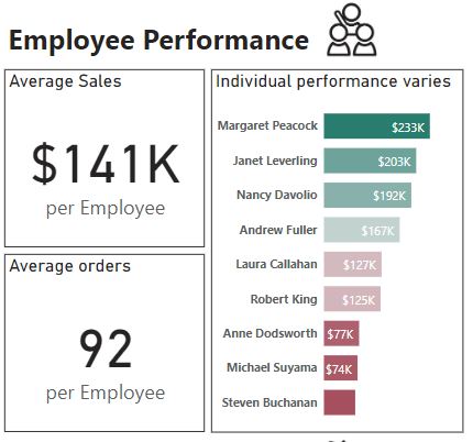
+ I compared individual performance using custom colouring on a bar chart. High performers were in green, while poor performers were scaling to red.
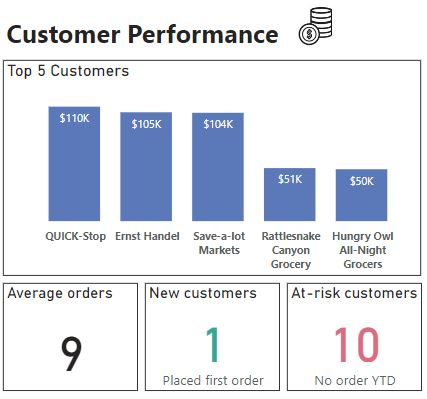
+ Average orders per customer: DIVIDE the Number of orders over the Number of customers.
+ New customers: this one was another tricky one. The first step was identifying the first year a customer placed an order. I achieve this by using SUMMARIZE, YEAR and CALCULATE. CALCULATE was vital because it created a context transition, where the customerID in the Customer table became the filter context. In the next step, FILTER the summarised table and kept only "first year" = the current year (2015 in the data) was kept. Finally, COUNTROWS identified the Number of new customers.
+ Customers at-risk: similar to the measure above, customers at-risk were those who had not had an order in the current year. Their "last year" was less than the current year.
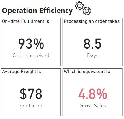
+ Processing time: the AVERAGEX of ShippedDate - OrderDate; remember to FILTER out ShippedDate = 0.
+ Average freight: showed the average of the freight column using a card visualisation.
+ Freight / Gross Sales: DIVIDE SUM of freight over Gross Sales Revenue.
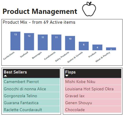
+ Bestsellers and Flops: added two extra columns to the Products table using RANKX, ALL and CALCULATE (COUNT). CALCULATE(COUNT) provided the frequency of ProductIDs from the Orders table. RANKX and ALL then ranked the frequency. Sorting the column with DESC positioned the Bestsellers at the top, while sorting with ASC showed the Flops at the top. Showing the top 5 names using tables accordingly.